The most prominent feature of this garden village 'Am Freihof' is a
curved avenue of trees lined with houses on either side. It is not a formal
feature as this wide curved street doesn't connect anything. It does however
create a great sense of s[pace at the heart of this housing estate.
In keeping with the design idiom of the Garden City
Movement planted verges feature as part of the design. Most are planted with
small fruit trees or ornamental blossoming trees. As with other housing estates
funded or planned by the Viennese council, this estate has a commemorative text
in metal letters attached to the side of one of the houses on the entrance from
the through route to the centre of Vienna.
Closes are a way of maximising parcellation. Here the
closes are always located at the centre of a block. The houses are placed at
the end of a cul-de-sac, often around a small expanse of grass. As a result of
the large gardens in this garden village, the closes are placed rather far
back. They are thus more isolated incidents than a visual feature.
The houses are typically rendered and painted in soft
tones. These tones vary, although the houses in building phase 2 all share
these yellow and ochre tones. Large gateways give access from the curved avenue
to the streets behind. Here a small garden creates visual interest and also
marks the axial shift in the street line.
These houses were built prior to the development of
this garden village by two cooperating Building Societies (Baugenossenschaften).
They are very similar to the later housing.
Very simple ornamental feature break up the terraces
and create interest in the facades. In some buildings the entrances are
emphasised by a slightly protruding surround with a moulded edge in a darker
colour. Also note the band below the window on the first floor. In other places
a difference in colour is used to emphasised the windows and doors by painting
a frame around them.
By staggering the building line -another Unwinesque
design solution- streets are made to appear shorter. A difference in roof shape
and height of the facade is also employed here to create visual interest and variation.
As these are owner-occupied houses, homeowners have
put their mark on the building, often by the use of colour. The original pea
green has been painted over with pink paint (on the left). Also note the tiny
gable end in the pink building, used to break op the long line of the roof.
Some buildings have these large concrete frames emphasising some of the
entrances. Here with an original floral ornament above the entrance. The awning
is a personal addition of the owner.
Around the central square several shops were
incorporated into the plan. The rectangular shape is emphasised by the closed
facades around. Here the shop fronts on the ground floor are emphasised by the
use of brick with the standard yellow render above. Also note the round
"tower" in the corner.
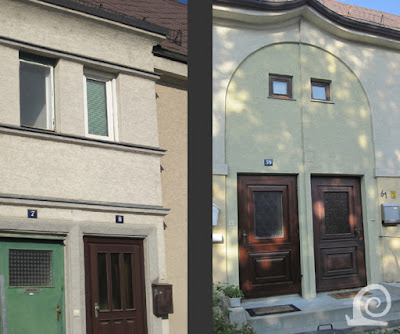
Some examples of more elaborate ornamentation around
the entrances. The entrances are combined per two and located in a protruding
section with ornamental ribbed bands dividing the facade. This secession inspired
entrance again features a combined entrance of two homes in a terrace. Her the
roof is raised slightly and a panel (slightly recessed) with a generous arc
surrounds the doors and the windows of the bathrooms above.
These semidetached properties break up the rows of
terraced housing along these typical garden village streets with grass verges
planted with blossom trees (Rowans here). Again the awning by the entrance is a
later addition. All front gardens were originally planted with a privet hedge.
Some of the details show the architect drew
inspiration from modernist buildings as well as vernacular architecture. These
flat elongated sections of the facade are a feature in the first two building
phases. Sometimes they are used to emphasise a corner where two streets meet.
In other places these features are used to break the long facades and roofs of
the terraced housing.
The housing of the third building phase features
longer terraces with little ornamentation, except for a crimped roof edge and
colour blocking around the entrances.
Another example of colour blocking (left). Here the staggered
building line is emphasised the squared-off shape and by painting the protruding
corner a green colour to contrast with the section of the terrace placed
further forward. On the right a more subtle example of colour blocking with a
raised panel around the windows in a different colour. Also note the roof trim
treatment with small ornamental triangles.
The housing in the last building phase is more plane
with little ornamentation. The roofs are typically hipped. But the sections
with the entrances have a flat roof with a wide rim in wood.


No comments:
Post a Comment